

Make components respond to learners
An interaction connects something a learner does to a result. In this example, Show guidance reveals a leadership reminder and Hide guidance hides it again.
Use a separate Guidance practice step in your Design System practice scenario. You’ll need one Text component and two Buttons; arranging components and editing their content cover the basics.
1. Prepare the guidance
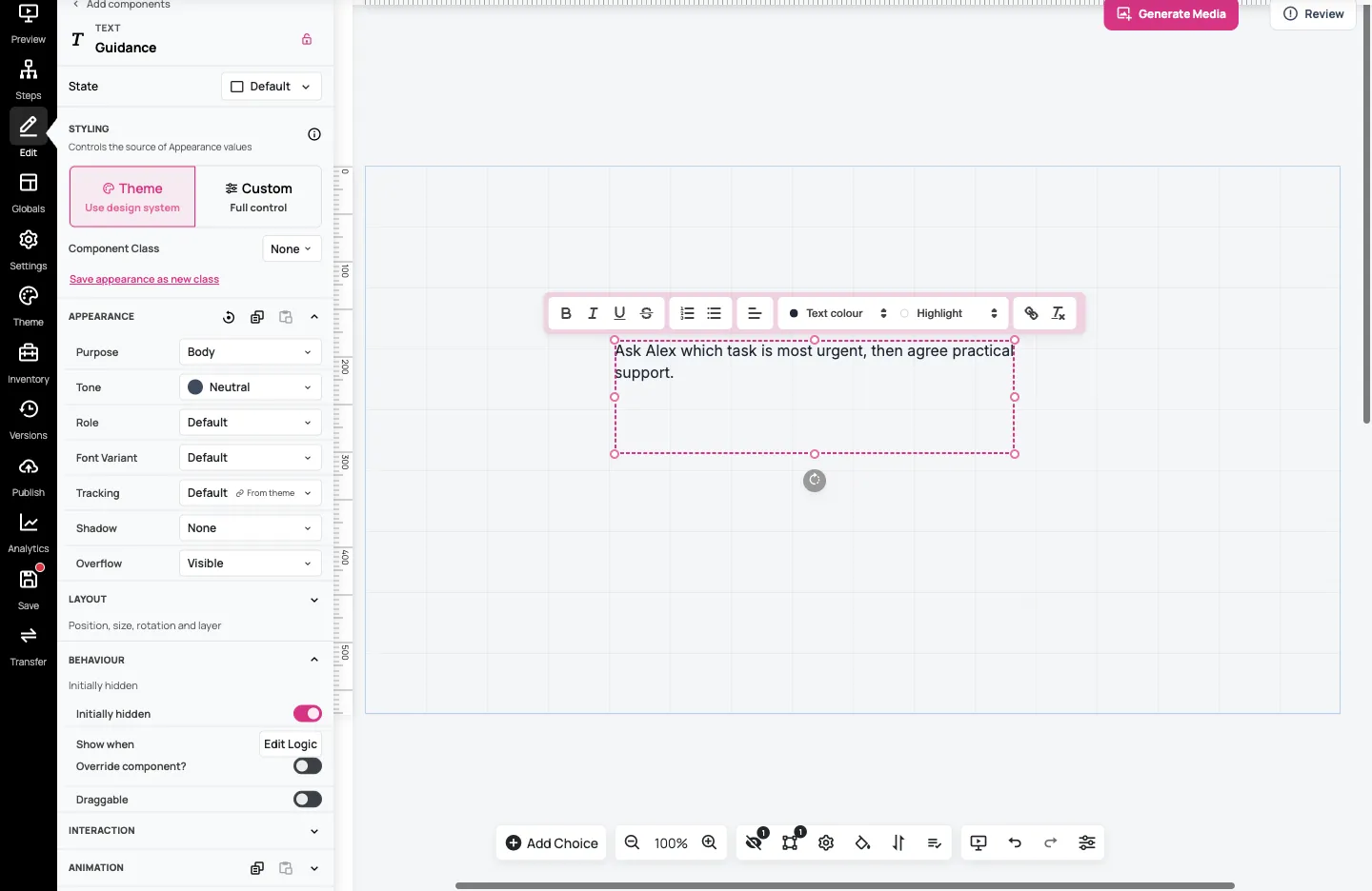
Section titled “1. Prepare the guidance”Add a Text component and rename it Guidance using the name field at the top of its settings. Double-click its canvas text and enter:
Ask Alex which task is most urgent, then agree practical support.
Expand Behaviour and turn on Initially hidden. This is the guidance’s starting state for learners; you’ll check it in preview.
Add a Button from Add Component; expand Navigation & Interaction if needed. Rename the component Show guidance, then set Content → Text to Show guidance as well. The component name helps you find it in the editor; Content Text is the label learners read.
Position the button above the guidance. In our 1024 × 576 example, the button is at X 302/Y 150 and the text is below it at Y 260. Leave enough space for the whole sentence when it appears.
2. Add a Quick Interaction
Section titled “2. Add a Quick Interaction”With the Show guidance button selected, expand Interaction. Select Add interaction → Show component, then Select component → Guidance.
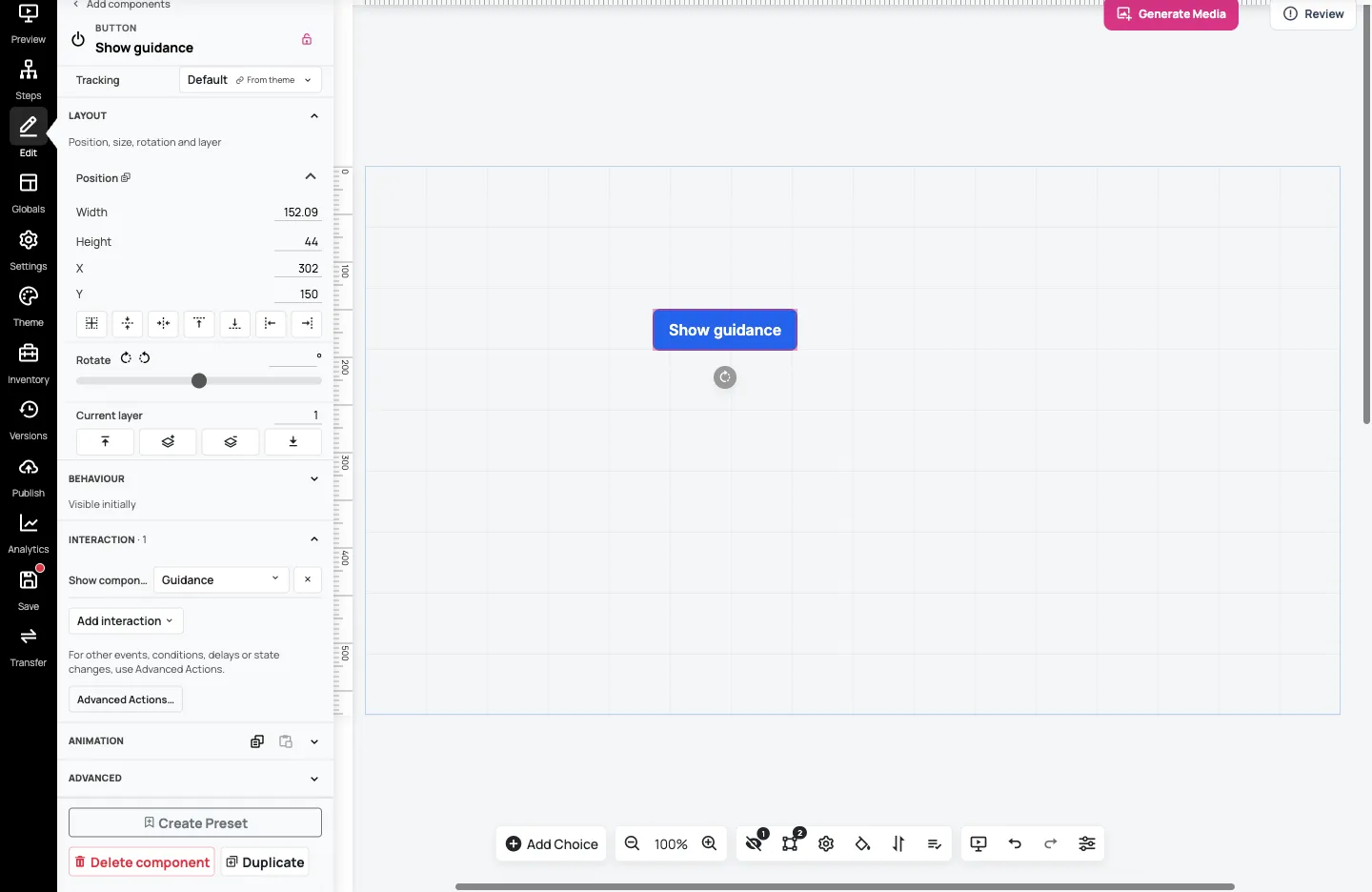
For this Button, the interaction runs when the learner presses it. Its available quick options include navigation, showing or hiding a component, and tooltip or popover content. Other component types can offer different options or events.
Select Save. In preview, open Guidance practice using Go to Step if needed. The guidance should start hidden and appear when you press Show guidance.
3. Open Advanced Actions
Section titled “3. Open Advanced Actions”Quick Interactions suit common tasks. Use Advanced Actions… for other events, optional conditions or more involved action sequences.
Return to the editor and add another Button. Name it Hide guidance and set its Content → Text to Hide guidance. Place it beside the first button; our example uses X 500/Y 150.
Select this second button, expand Interaction, then select Advanced Actions….
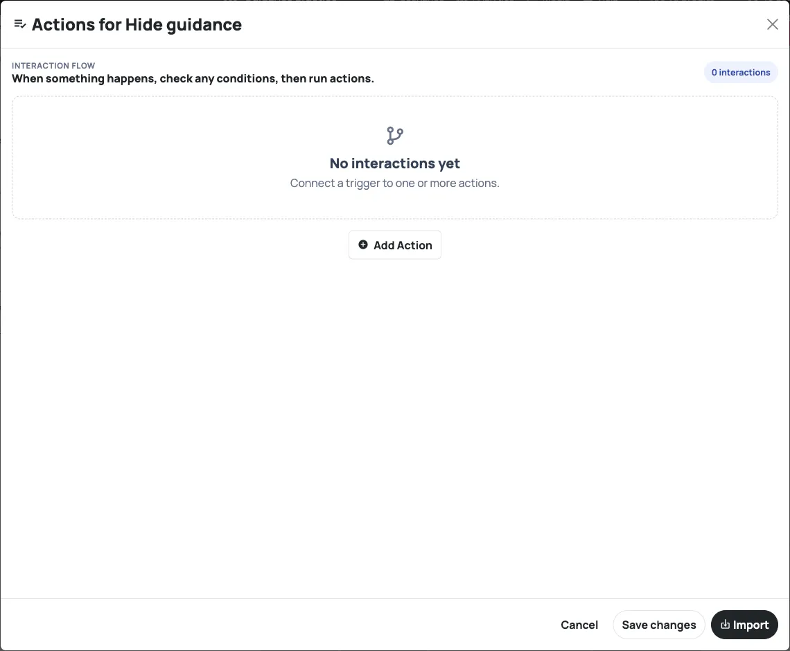
The basic flow is: an event starts the interaction; any conditions decide whether to continue; actions perform the result. This example needs no condition.
4. Configure one action
Section titled “4. Configure one action”- Select Add Action.
- Choose Add New Event → When Pressed.
- Select Add action in the action column.
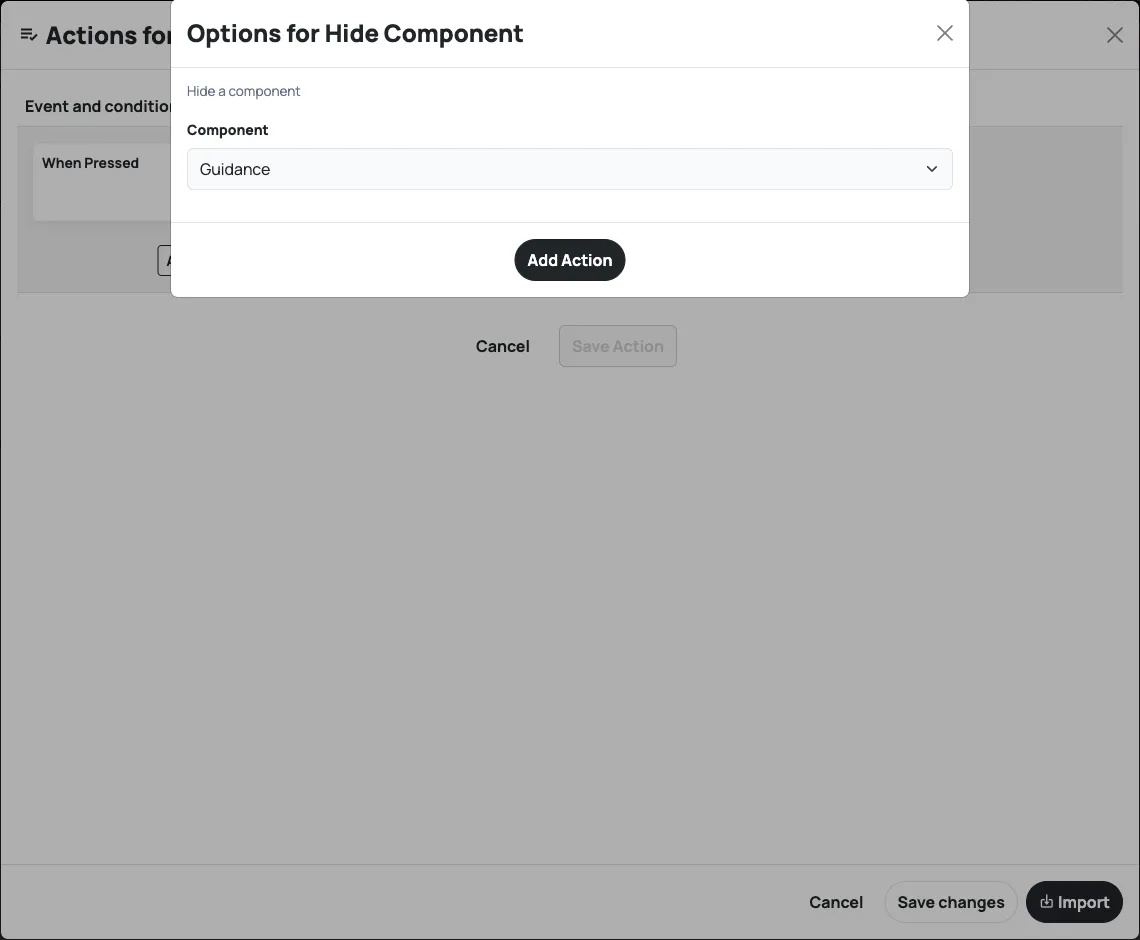
- In Choose an action, choose Hide Component.
- In Options for Hide Component, choose Guidance under Component, then select Add Action.
- Select Save Action to finish this interaction.
Read the summary. It should show When Pressed, No conditions · 1 action, and Hide Component: Guidance.
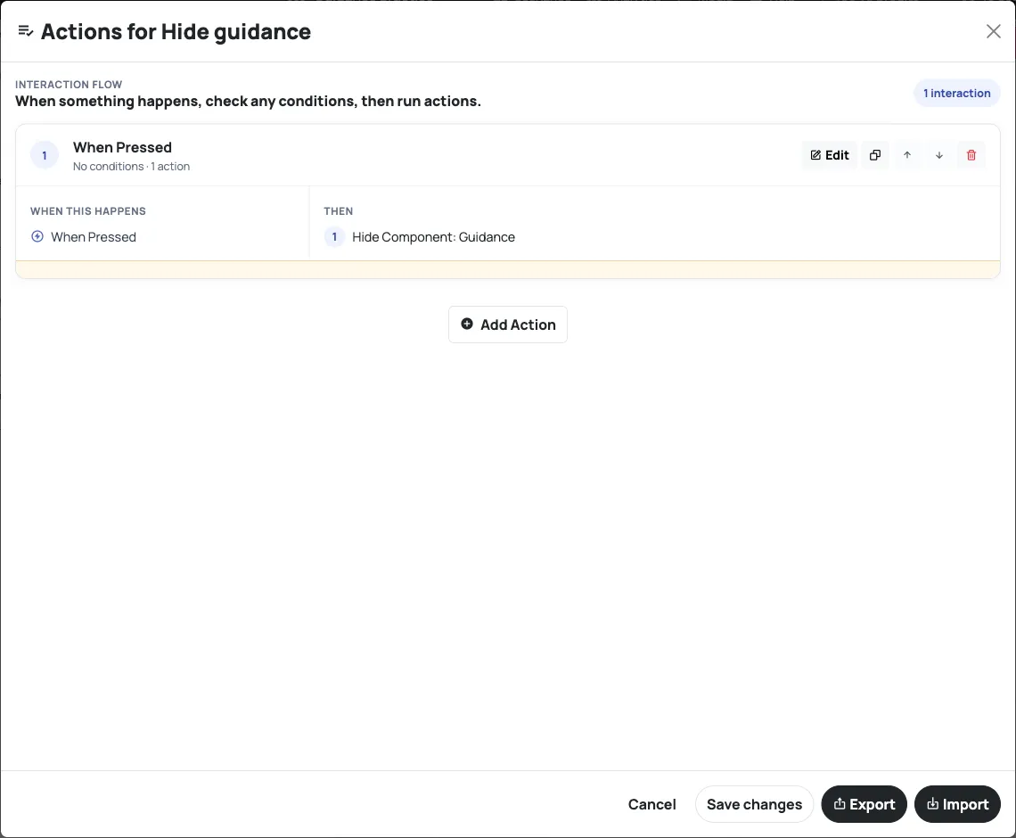
Select Save changes to leave Advanced Actions, then Save in the scenario navigation. These finish different parts of the workflow. Reload the editor before the final test to confirm the saved behaviour.
5. Test the result and its starting state
Section titled “5. Test the result and its starting state”Open a preview and use Go to Step → Guidance practice if the preview opens elsewhere.
- At first, only the two buttons should be visible.
- Press Show guidance and read the reminder.
- Press Hide guidance and check that the reminder disappears.
- Close the preview, open a fresh one and return to Guidance practice. The reminder should start hidden again.
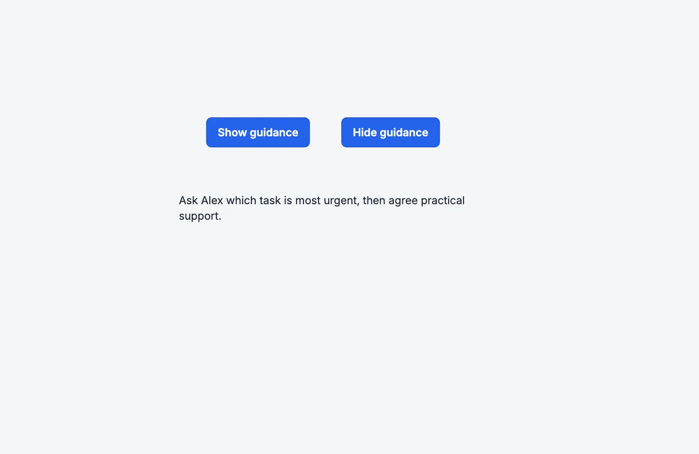
If the text covers a button, return to the editor, adjust its position, save and repeat the test. Check the target component and saved action summary if a button affects the wrong content.
You now have a tested reveal-and-hide interaction. Continue with Test every path before sharing to check how interactions and decisions work together.