

Edit component content and appearance
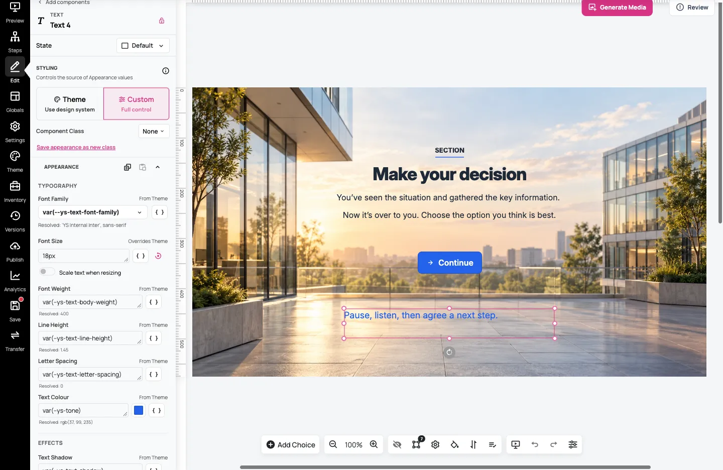
Give a component the right words and appearance for your learning activity. This guide uses the text note Pause, listen, then agree a next step. on the leadership practice step from Arrange a step with layouts and components.
You can follow the same process with another text component in a Design System scenario. Keep practice edits separate from your approved original.
1. Select the text component
Section titled “1. Select the text component”Open the step with Edit this step, then click the text you want to change. Its settings replace Add Component on the left. Check that the panel identifies it as Text and the correct component is outlined on the canvas.
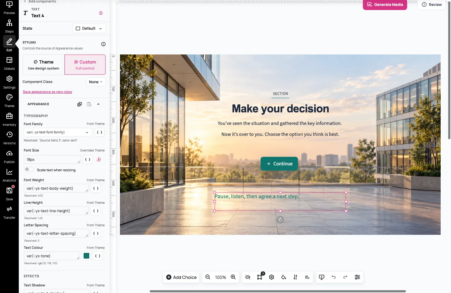
The component name at the top helps you organise your work. Changing that name does not change the words learners see.
2. Edit the learner-facing words
Section titled “2. Edit the learner-facing words”Double-click the text on the canvas. Select the placeholder or existing words, then type your replacement:
Pause, listen, then agree a next step.
Use the rich-text toolbar for common changes such as bold, italics and text alignment. Click outside the text when you’ve finished.
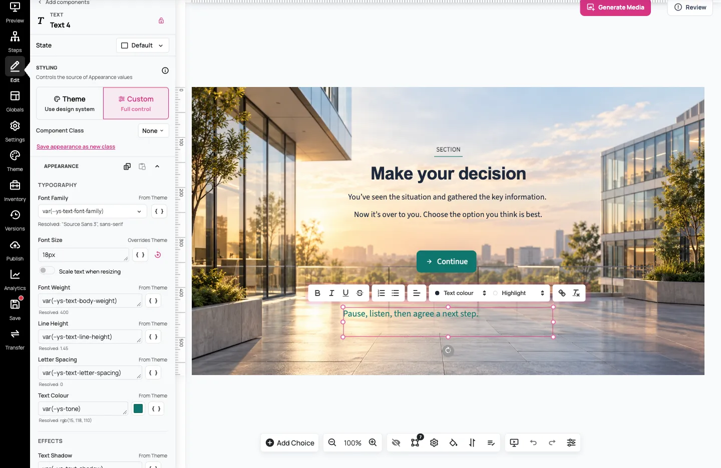
Read the whole sentence after editing to check that you replaced the intended words. Keep it short enough to fit the available space.
3. Use the theme’s appearance options
Section titled “3. Use the theme’s appearance options”Under Styling, Theme — Use design system lets the component use the scenario’s Design System appearance. The Appearance section offers choices appropriate to this text component, including Purpose and Tone.
For this note, keep Purpose as Body and choose Accent under Tone. The component uses the theme’s accent styling rather than a fixed colour of its own.
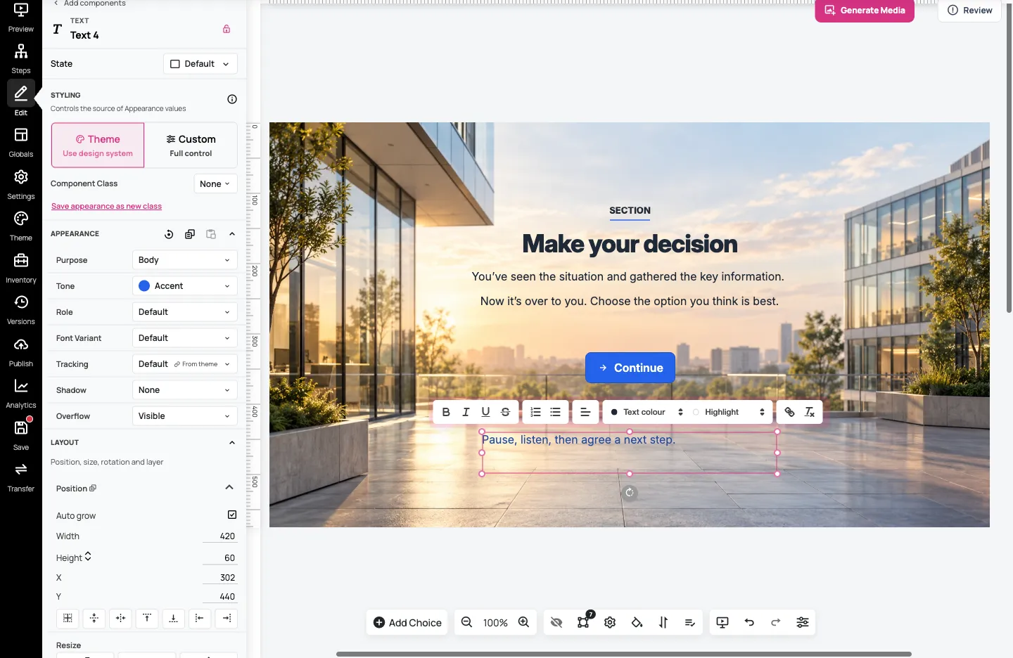
A theme change can therefore change the accent used here and elsewhere. Other components have their own appearance choices; the Text controls aren’t a universal settings list.
4. Make a local adjustment
Section titled “4. Make a local adjustment”For finer control of this component, choose Custom — Full control under Styling. In Appearance → Typography, select Font Size, replace its value with 18px, then click outside the field to apply it.
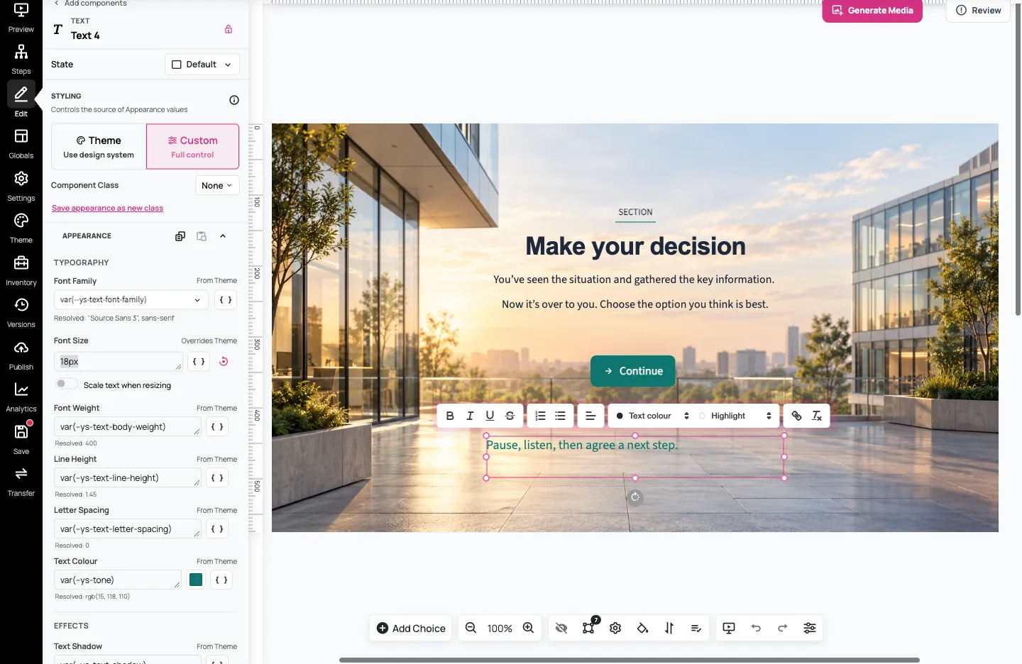
From Theme identifies an inherited value; Overrides Theme identifies a local choice. Changing Font Size here affects this component, rather than every text component in the scenario. Use the field’s Reset to inherited value control if you want it to follow the theme again.
You can leave other values inherited. For example, this note can keep its theme-based Accent colour while using a fixed 18px size. Avoid adding local changes when a shared theme setting would better express what you want.
5. Save, reopen and preview
Section titled “5. Save, reopen and preview”Select Save, then reload the step. Select the note again and check that its wording and 18px size persisted.
Return to Steps and open a preview. Use Go to Step → Layout practice if the preview opens on the starting step. Check that the text is readable, fits its box and doesn’t obscure another control. Adjust its space under Layout → Position if needed, then save and check again.
You’ve changed the learner-facing text and one component’s appearance. Use Customise and reuse a theme when you want a consistent change across the scenario instead.
Ready to make a control do something? Make components respond to learners shows a simple reveal-and-hide task.
For supported Image and Design System Audio components, Content → Generate opens a separate media-generation form. Other fields can have different controls. See Generate images and audio with AI or Upload and reuse media.