

Arrange a step with layouts and components
Build a step from a ready-made arrangement, then add a small detail of your own. By the end, you’ll have a saved step that you can check in preview.
You’ll need a Design System scenario. If you’re following First day as a team leader, practise on a separate copy. Our example uses a step called Layout practice, leaving the original story untouched.
1. Open an empty step
Section titled “1. Open an empty step”In Steps, select Add step, enter Layout practice as the Step title, then select Add step in the dialog. Use the new step’s Edit this step control to open the editor.
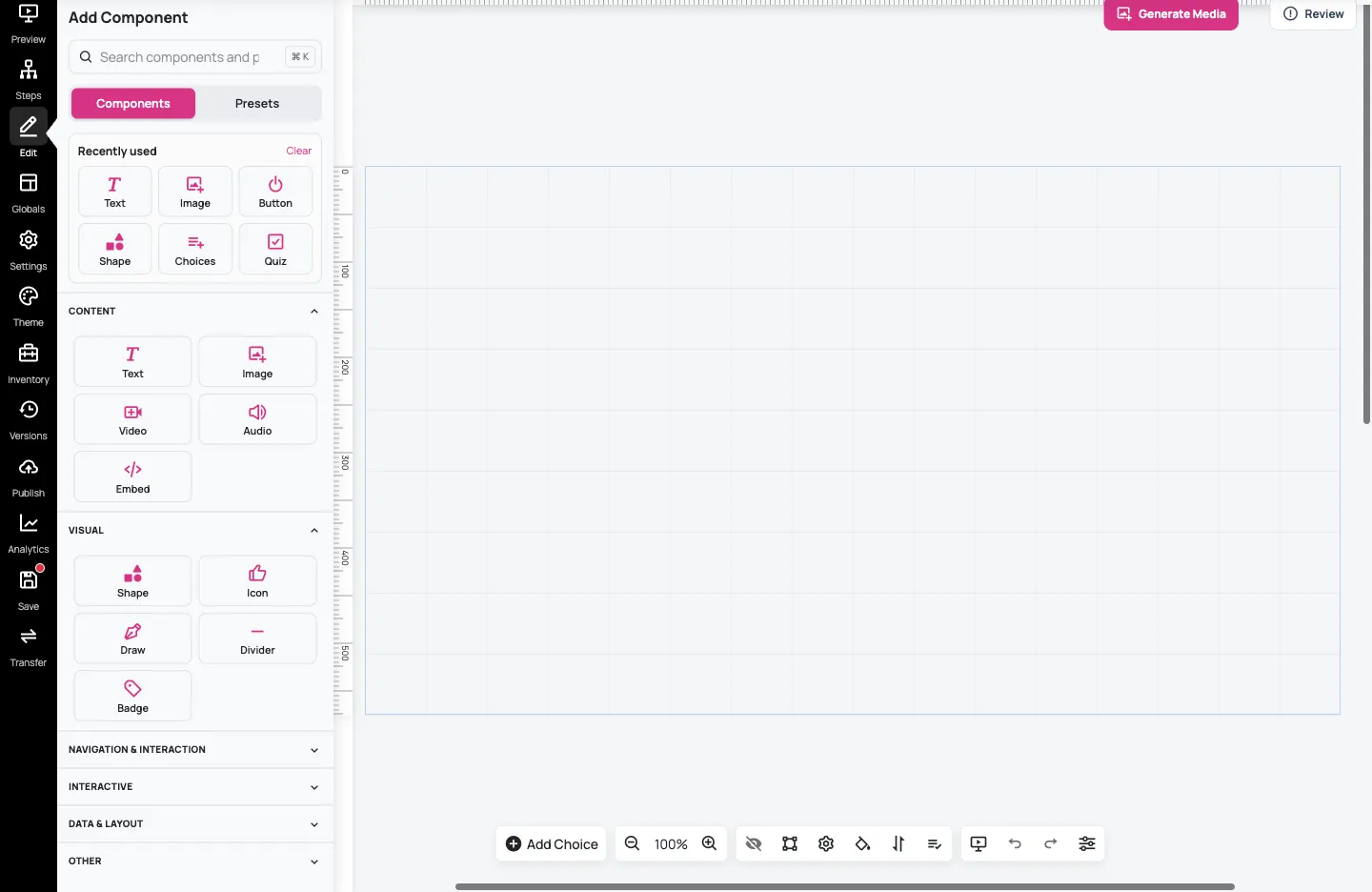
The canvas is where you arrange the content learners will see. Add Component is on the left; selecting an existing component replaces that panel with its settings. Add components takes you back to the library. Use Zoom out or Zoom in to see more of the canvas without changing the size of your content.
2. Start with a layout
Section titled “2. Start with a layout”A layout is a ready-made arrangement of several components. A component is one element, such as text, an image, a button or a set of choices.
In Add Component, select Presets → Browse all presets. In Preset Manager, choose Built-in, then Layouts. Select Centered Content and choose Insert.
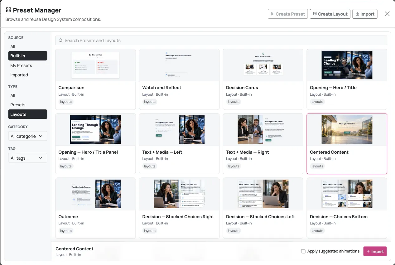
This example supplies a background image, sample text and a Continue button. Insert it on the empty practice step so you can explore its arrangement without covering your existing content.
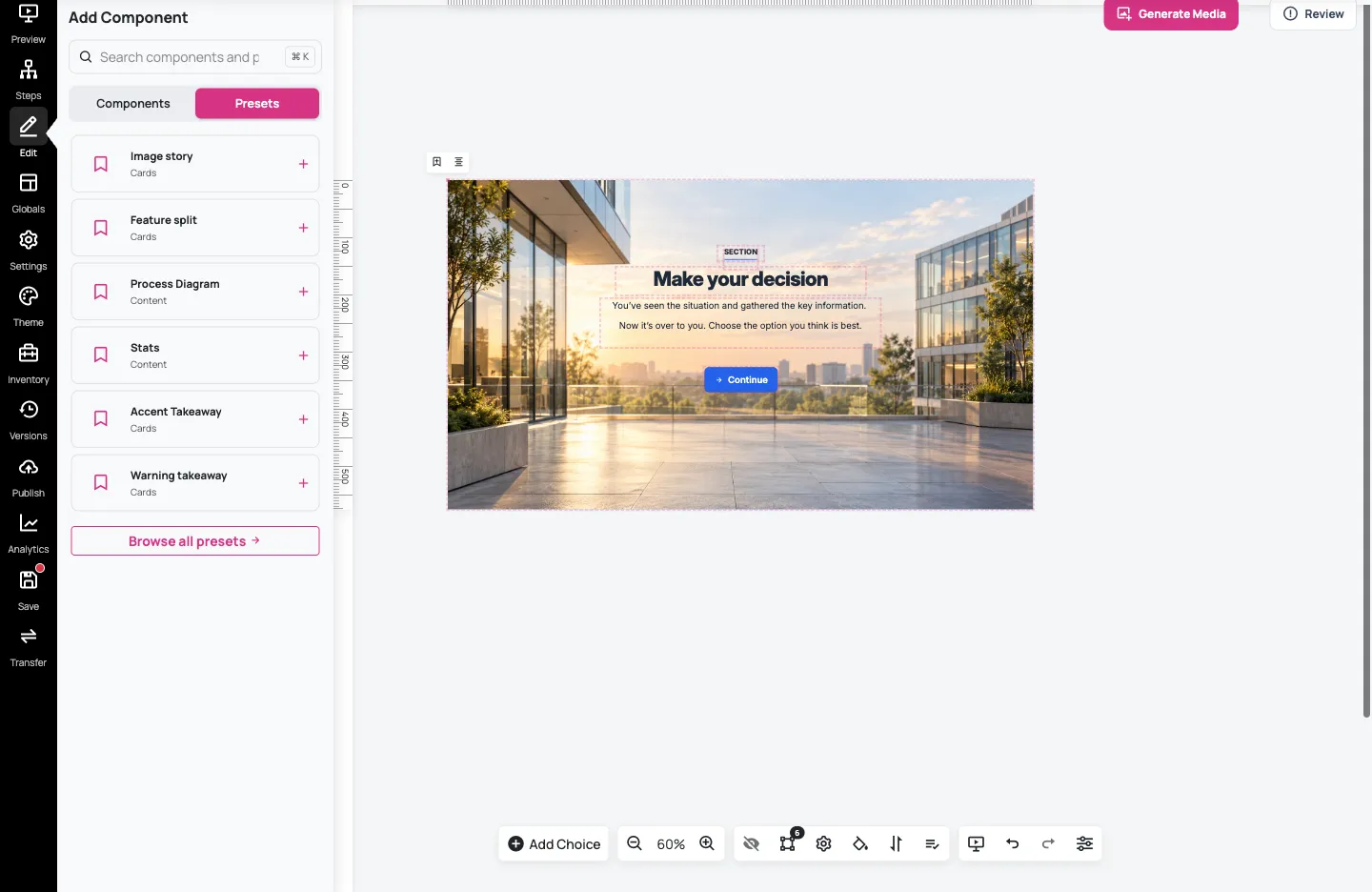
The sample text and controls are starting points. Replace them with content that fits your scenario, and connect or remove sample navigation before using the step in a learner’s route. Inserting a layout does not connect the step to the rest of your story.
3. Add one component
Section titled “3. Add one component”Return to Add components if necessary. Select Components, then Text. The new text component appears on the canvas and its settings open.
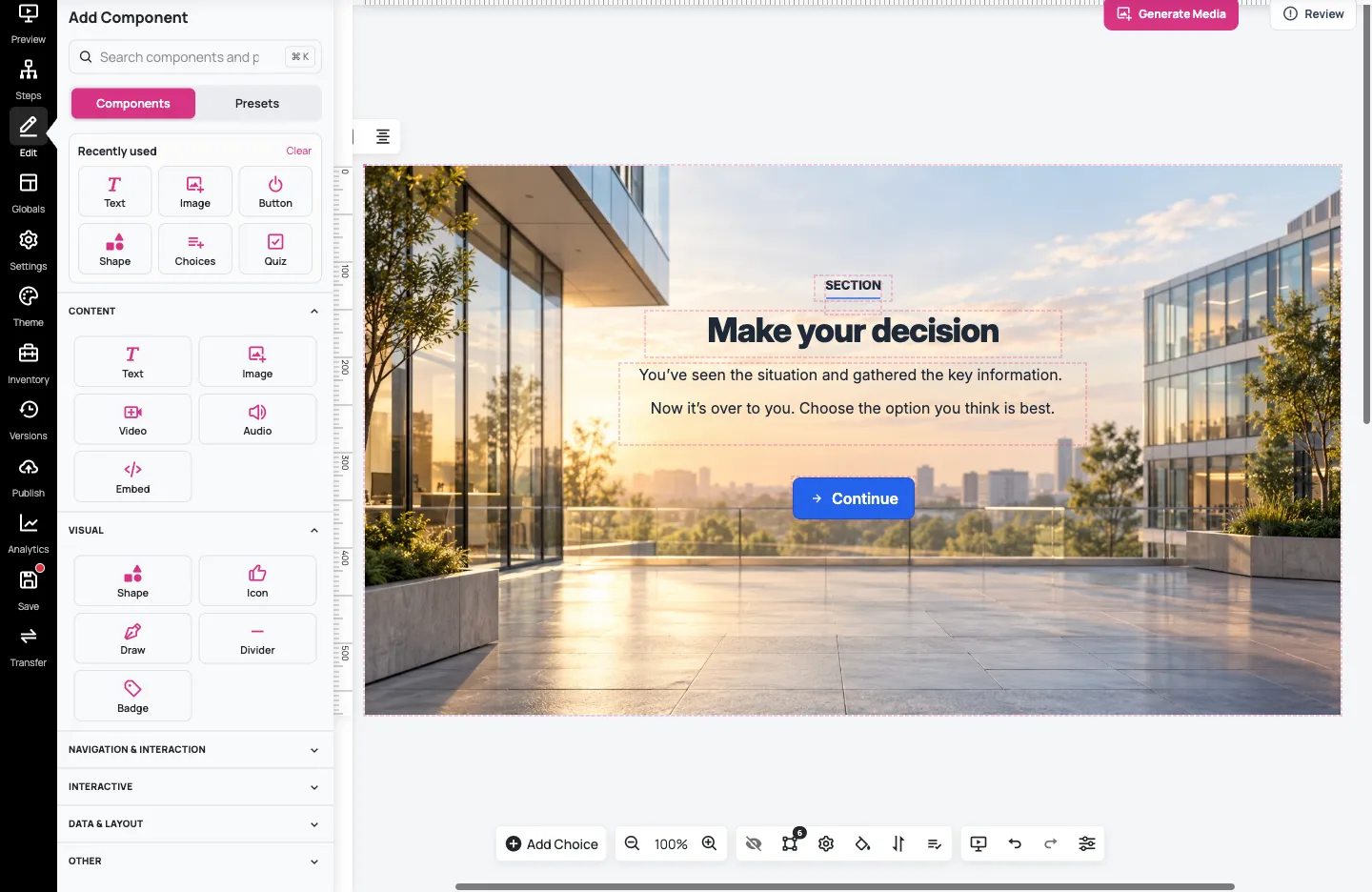
Double-click the new text and replace the placeholder with:
Pause, listen, then agree a next step.
Click outside the text to finish. See Edit component content and appearance for more about text and styling.
4. Position and size the text
Section titled “4. Position and size the text”Select the text component, then expand Layout in its settings. Position offers controls such as Centre, Centre vertically and Centre horizontally. Centre positions the selected component within the canvas; it does not change its text alignment.
Expand Position to reveal Width, Height, X and Y. These let you size and move this text component precisely. On our 1024 × 576 canvas, we used Width 420, Height 60, X 302 and Y 440 to put the note below the sample button. Adapt these values to your own canvas and content.
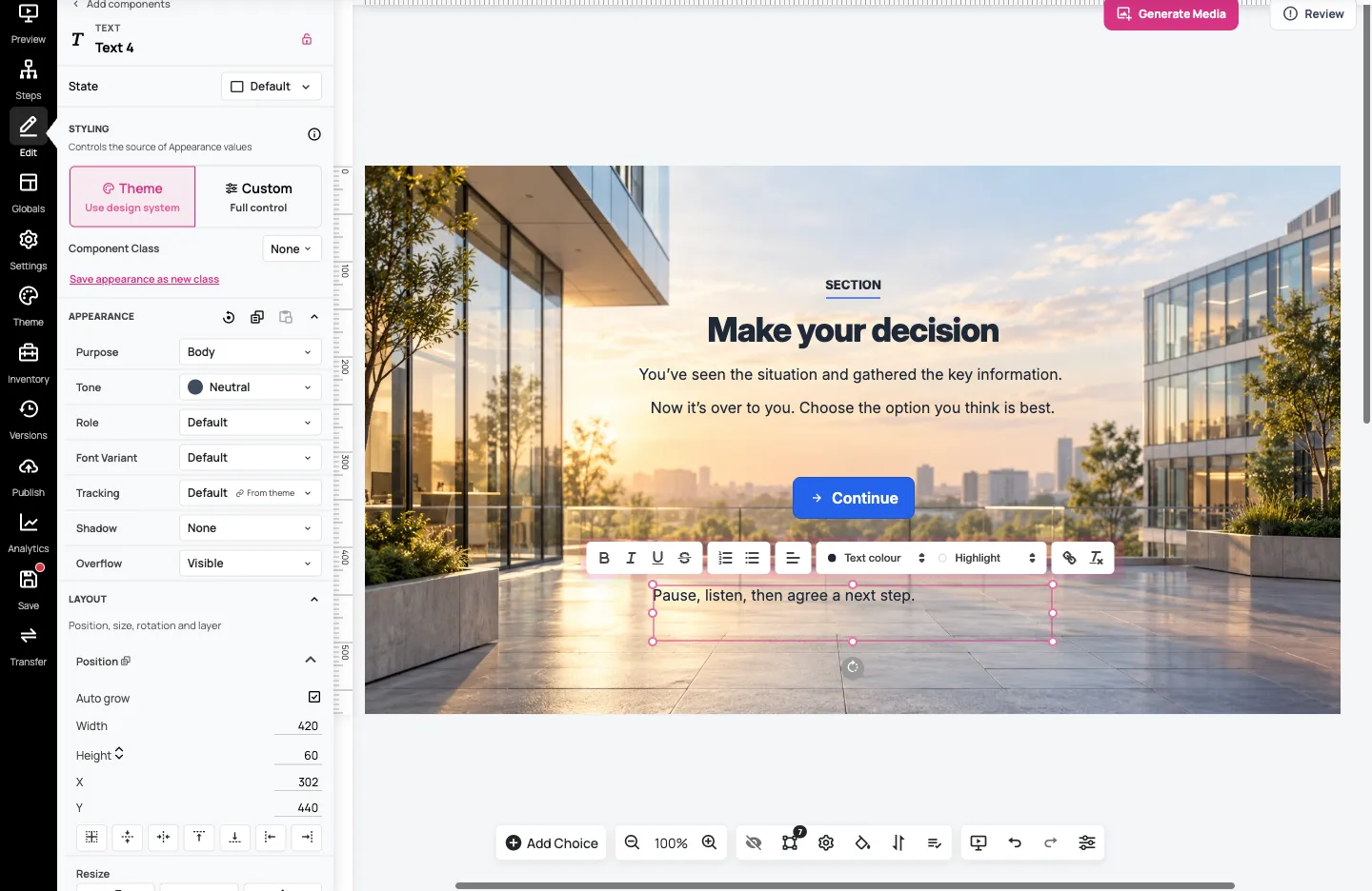
Check the result after each change. A longer paragraph may need more height or less text. Different components offer different controls: don’t expect every button, image, interactive component or group to resize in the same way as this text box.
5. Save and check the result
Section titled “5. Save and check the result”Select Save, then reload the editor and confirm your text and arrangement remain in place.
Return to Steps and open Preview from here on the practice step. Check which step actually opens. If the preview starts at the scenario’s opening, choose Go to Step in the preview toolbar and select Layout practice. This also lets you inspect a practice step that isn’t connected to the main story yet.

Check that the note is readable and doesn’t cover other content. The example shown also uses the teal theme from Customise and reuse a theme.
You now have a saved arrangement to build on. Next, edit a component’s content and appearance or explore themes for changes across the scenario. Use Add steps and connect decisions to build routes, then test them in preview.